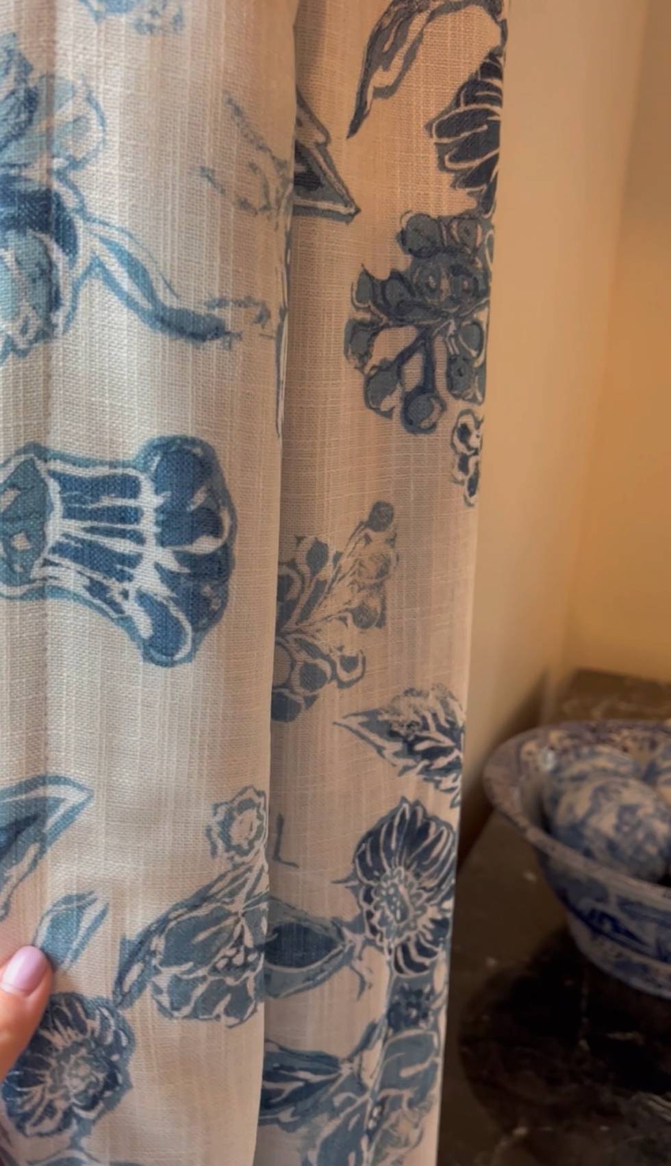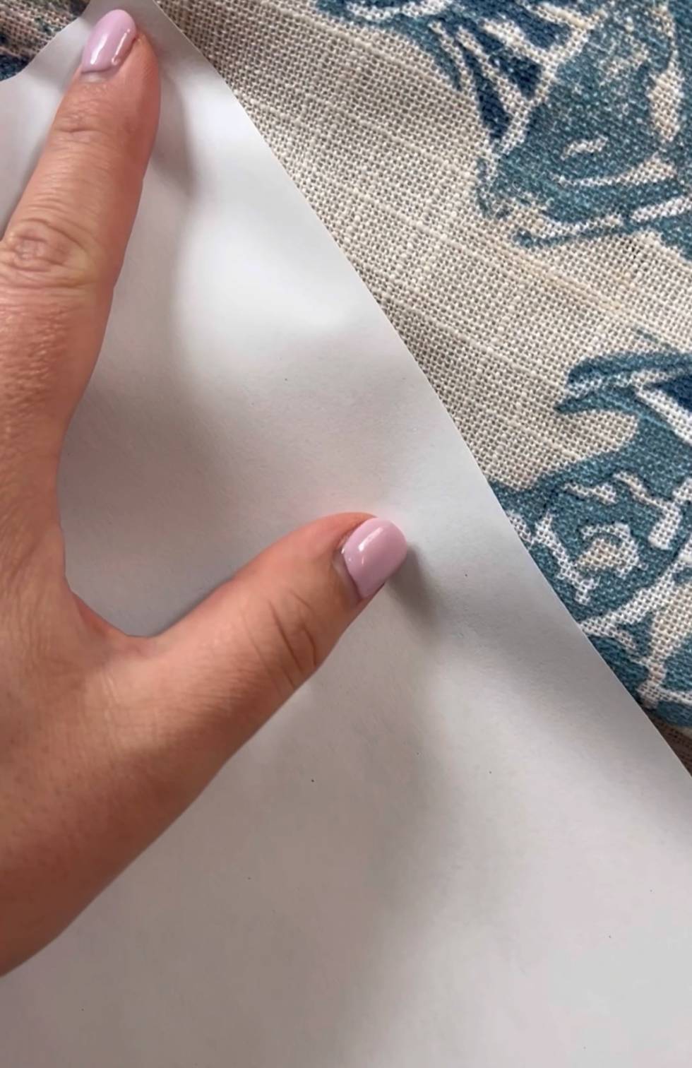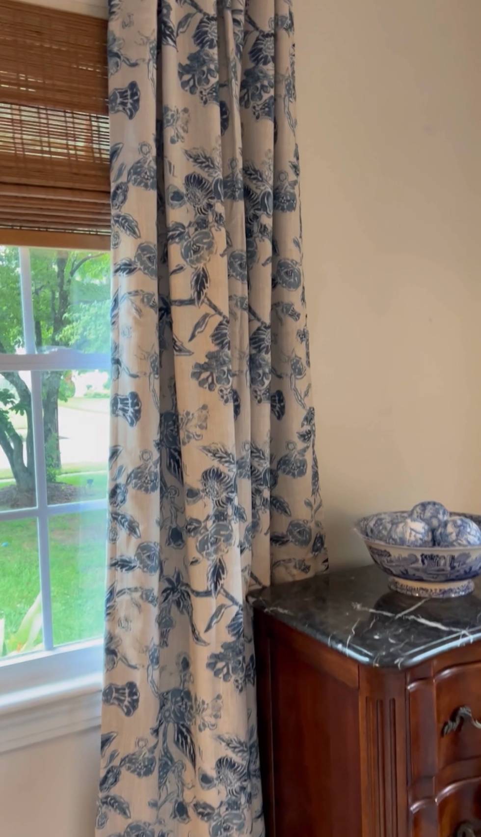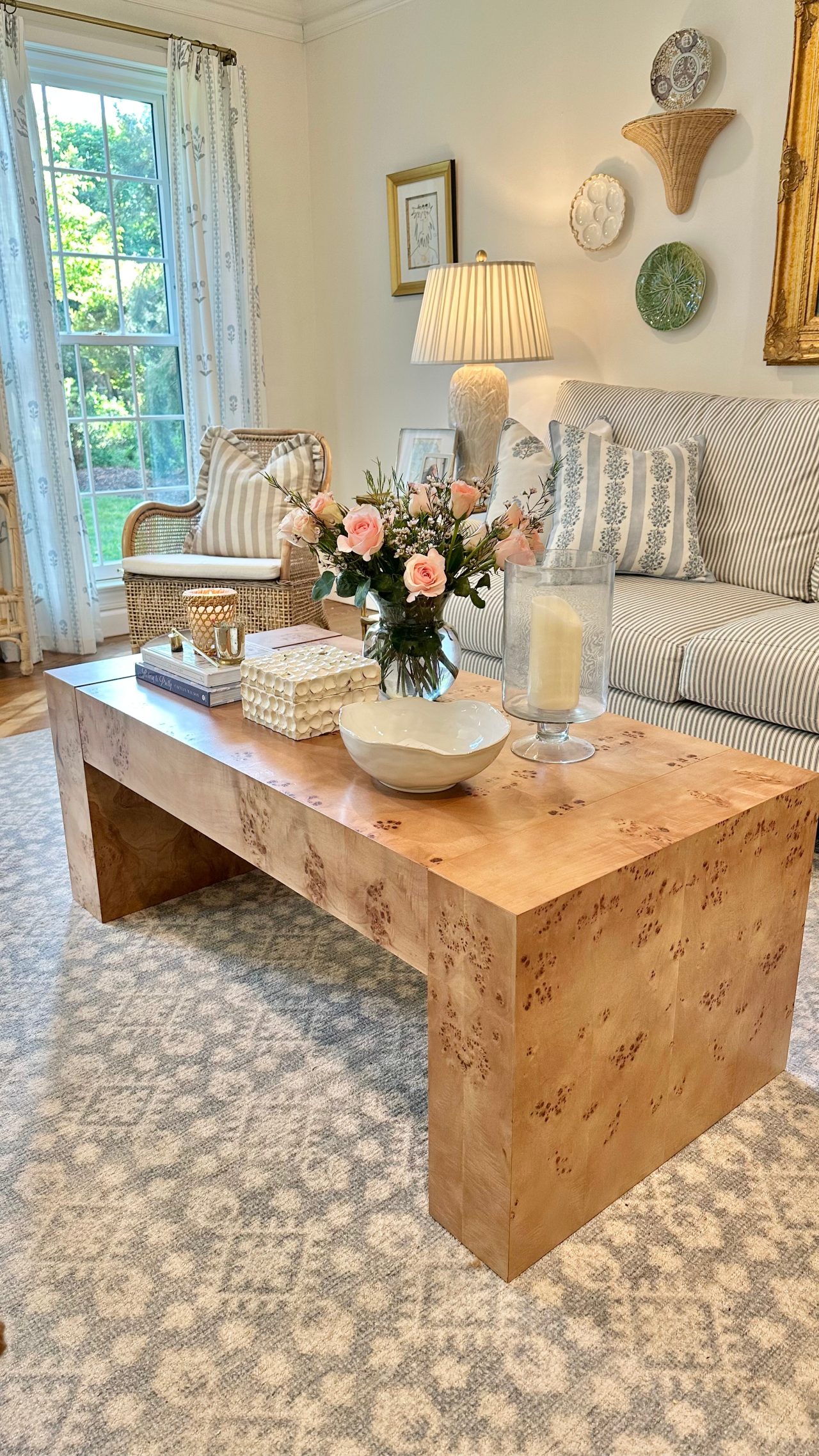
Time for another affordable curtain review! These curtains are exactly what I started this series. To be honest, they look nothing like their picture online would suggest. The background is not white – it’s more of a creamy oatmeal color. The blues are darker, too.
That being said, I LOVE that they don’t look like the photo.
I think they’re more organic looking.
The oatmeal/cream color is a perfect match for this house’s Swiss Coffee walls.
They’re also tab back or rod pocket ( I prefer tab back).
Hope you enjoy them!
Jill